A true millennial:
Started in analog, refined by industry.
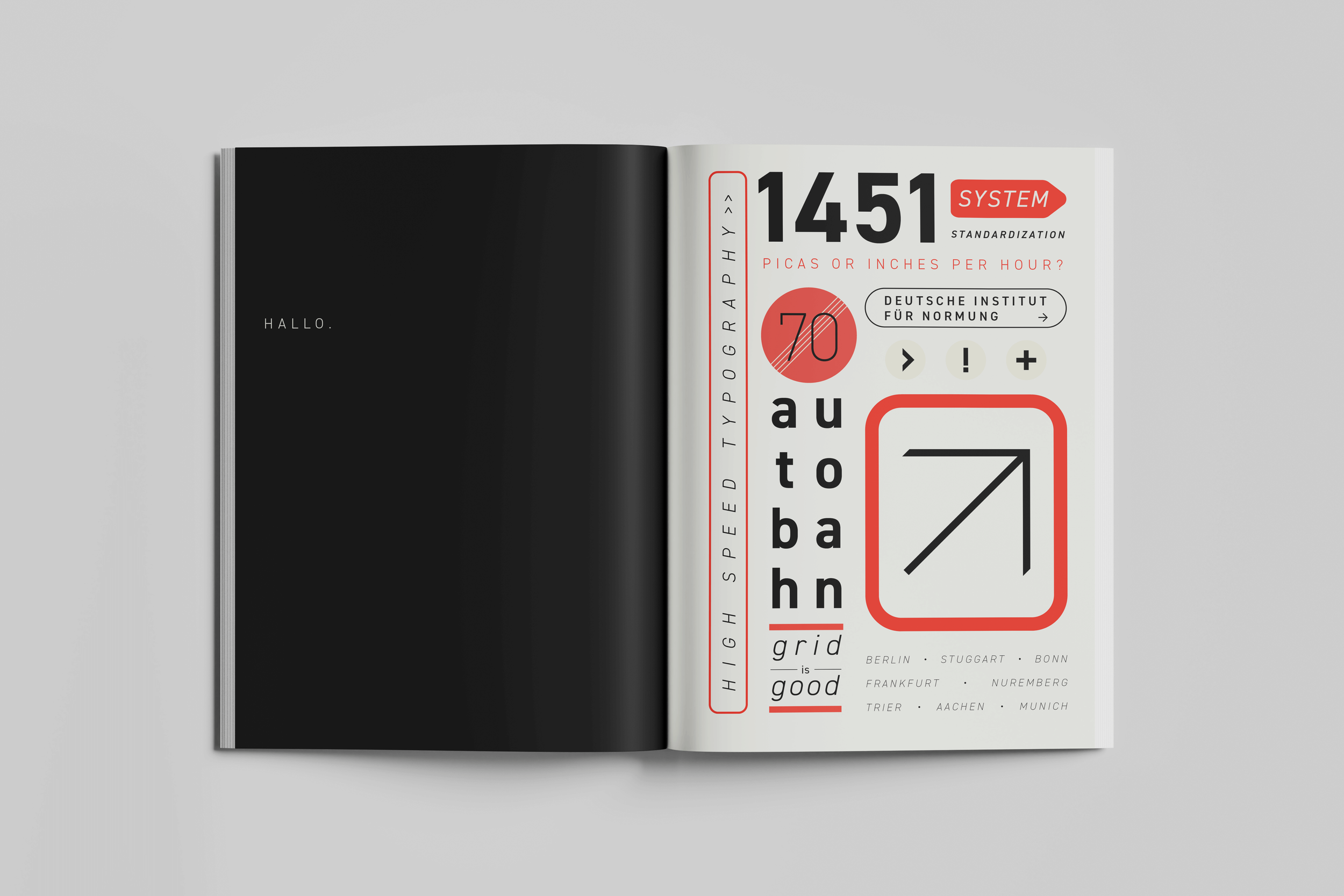
A sans serif with Constructivist origins, DIN 1451 was formulated on a grid rather than designed by hand. Albert-Jan Pool digitized the typeface in 1995, evolving it into the form we know today.
DIN traces its conception back to a typeface in 1906 that was developed for Prussian railways standards (the Königlich Preußische Eisenbahn-Verwaltung, or KPEV). Ludwig Goller oversaw the development of DIN 1451 for roadsigns and house numbers, as part of an effort from the Deutsche Institut für Normung (DIN) which was finalized in 1936.
This institute for standardization, which Goller helped found in 1917, is where the typeface gets its name from. Goller’s goal was to establish a standardized typographic treatment that was highly legible at long distances, similar to the KPEV typeface that inspired it. The typeface has been used on the autobahn, railway system, license plates, and post office.

Because the DIN institute carefully kept itself out of political affairs, DIN 1451 never appeared in Nazi propaganda and was never connected to the Nazi Party, as not many contemporaneous designs can boast. In a time when serif typefaces were associated with elitism and social inequity in Germany, DIN embodied:
Neutrality + Objectivism
Realism + Modernism
Functional + Utilitarian
Science + Mathematics
Other current variants include FF DIN, DIN Next, and DIN 2014.